Evaluation


Contents page:
I think my contents page is very basic, if I had more time I would like to of been more creative with this and experiment with artistic and visual ways to show my contents. However I do think it matches the theme throughout and represents the brand Dolce & Gabbana.
I chose this font as it is the closest font I could find to the Logo and website text that the brand use.

Introduction:
I really like the rich royal colours in the picture on this page as I think it is very representative of the brand, the elegant floral designs is a good way to start my report as it is allowing the reader to visually see what the brands ideas and concepts consist of. I had difficulty when I exported my Indesign file as a PDF as I found that it lost the quality of my image, I tried to maximise the quality and change some of my images however I still found that they ended up being slightly blurred. I think the lines on the left hand side make it very compact and easy to read, I decided to have this as a theme running throughout.

PESTLE
I really like the simplicity on this page, as there is a lot of text I didnt want to saturate it with images as well. I like that each section is clearly seperated therefore the reader can see which section is which, I think that because the paragraphs are all different sizes, the way the paragraphs are split and do not line up works better, I again have the lines on this page to make the pages link together. I found the research and the information for this section really interesting however I found technological really difficult to come up with ideas for.

SWOT analysis
I like the image in this page as I think it is continuing the rich jewel tones that I think the brand is very well known for. I have chosen traditional floral designs. I have tried to make the first half of my report represent traditional and old school Dolce & Gabbana as I think it helps to visually represent the difference between the original brand and my proposed brand. I think it is very easy to read in this format, however I didnt want to put it into a table/ grid as I dont think that would fit the Dolce and Gabbana aesthetic I am trying to represent.

Competitors:
I like that the colours in my moodboard all connect as it keeps it very professional looking and there isn't too much going on. I also have my brand positioning map which I thought is very clear and easy to understand. I wanted to keep this page as simple as I could as there is a lot of information and it could get very confusing for the reader, I was really pleased with how this page turned out.
I found it Interesting to explore all the existing competitors and how they compete with each other, I really enjoyed researching this part.

Consumer demographic:
This page I was trying to explain that I think Dolce & Gabbana targets to many consumers and rather than focussing and putting more effort into one it is split over so many and leaves some consumers feeling neglected. I have chosen to do that by having my moodboard for this section feature all different demographics wearing Dolce & Gabbana. I decided to add flowers and paint as well to add to the fact that the brand doesn't really know who they are targeting. I have tried to keep my text short for this section as I have tried to visually explain and justify why I think that in my text.

Product selection
I like how the pink floral theme runs over the double page spread as I have tried to make them link, I also have chosen a picture I feel is relevant to the topic. I think this page looks very professional and the text is clear and easy to read. However in the printed version this image on the right is very pixelated.

Social media and Influencer marketing
I put my graph on this page to show the age of instagram users, I chose the colours I did on the graph as I think it runs nicely into my theme and it matches the colours in the mood board. There was a lot of information for this section and I found it very hard to condense it down into the word count. However I think I have managed to do so and it contains the main points. I found this section really interesting as it is something I am personally really interested in therefore I really enjoyed researching and writing about it.

Marketing mix
I found this page very difficult to look visually pleasing as all of the pariahs vary in size. However by putting them in a smaller box on the left and a larger box on the right I think it balances it out and makes it look better. I like the spring / yellow theme ion these pages, and I think it works well that they are similar images of a full body women. This page looks very blurry in my printed out version and I would like to improve the quality if I had more time. I found the marketing mix quite difficult to write about as I didnt know what to expand on in each section, however I found the promotion section really interesting as there was loads to write about.

I put this double page spread to conclude my research about Dolce & Gabbana and visually show what I think the brand is best at. After this point I have decided to flip my brand report around and have it a very colourful and young aesthetic to contrast with the professional and clean look at the start. This is so the reader is clearer on the points I am making and can see the difference between the aesthetic of the two brands. I think this page is a good summary and almost concludes the points I was trying to make.

This image is very representative of my new D&G brand. I think the bright colours and the quirky theme in this picture is a good opening point for the reader and will leave them feeling intrigued.
I have made sure I have put a clear title and left a page with just an image so that the reader does not get confused. For my recommendations I found that there was so many areas the brand could improve upon and I loved the process of researching and putting my own ideas across.

Recommendations
This section is a conclusion almost of my research and what my main recommendations are going to be, I think that this quote by Domenico Dolce is very relevant to my new brand. I like the pink theme running throughout this. I have also continued the theme of the black line which runs throughout my theme however I have decided to turn it around to show I am talking about a separate brand now.

D&G
As D&G is a millennial focused brand I think the use of younger models on the catwalks is good for explaining and backing up the points I have in my writing. I have used images all which have come from existing catwalks of Dolce and Gabbana to show which designs need to be separated and put into this new brand. This moodboard is very quirky and scattered and I think it represents the new brand and what that audience is into nicely. This is to show that the brand will be focussing on a new audience.

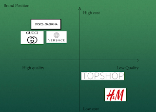
Brand position
I have tried to have a colour theme on each page to tie them together nicely and make them look like they should be next to each other. This moodboard shows the competitors and I have graffiti'd on it in photoshop to add to the aesthetic of the new brand to show the reader what sort of style they will have. I have put my brand positioning map on this page and have explained it as well as who the new competitors are too give the reader an idea of where it will be positioned in the market. I also have written the title on this moodboard twice which I would go back and change if I was to do it again.
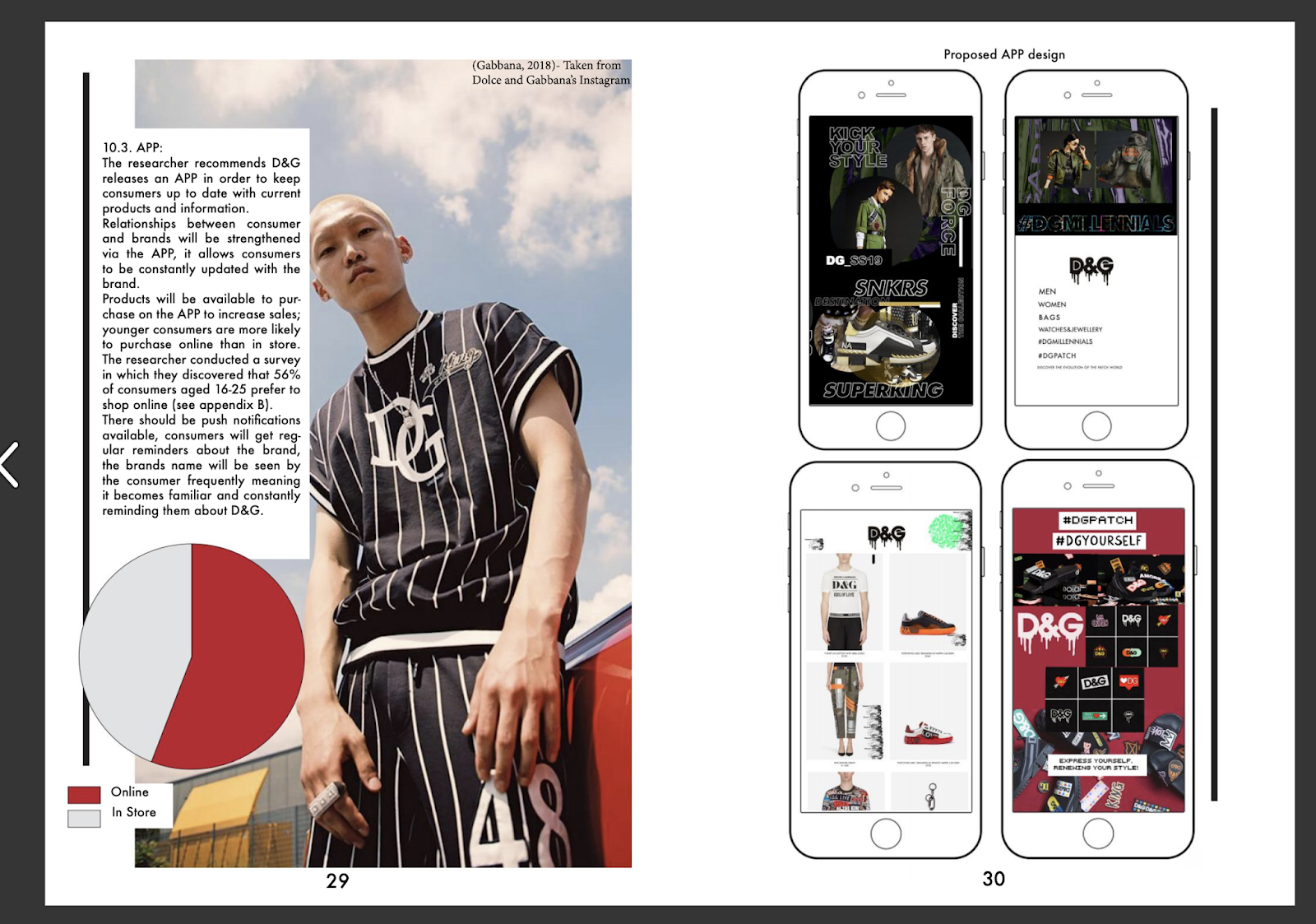
APP
Rather than explaining in text what the APP should look like I have made my own APP ideas of what I want it to look like. I think this ties in nicely and gives the reader an idea of what I am talking about. The pie chart colours tie in with the rest of the page and again I have used images of millennials who will be targeted by the new brand. I have used only existing screenshots and images from the Dolce and Gabbana page/ Instagram and website which justifies my point that the brand is already targeting this age range they just need to separate it and make it a different brand to the original one.

Sustainability:
I decided to split each section of the same recommendation up so that is was very clear and easy to understand. I used a green and brown floral theme in these pages to represent the topic of sustainability. I have chosen an image of a Dolce and Gabbana cat walk which I feel represents sustainability. I have used two pie charts to explain what I am talking about in my text, I think that because there is a lot of figures and statistics it helps to have a graph to explain.

Proposed Social media and Influencer marketing
this section I kept very concise and used my moodboard to show which influencers I suggest the brand uses, I also used examples of influencers such as Cardi B already wearing Dolce and Gabbana and the influencers they have already previously used to suggest that the brand continues to do what they have been doing in the past.

Cruelty Free
When I printed this section out it came out very blurry and pixelated, If I had more time I would ensure that this doesn't happen. I` have used another pie graph to visually explain the information which is in my text.

Streetwear collaboration
I decided to do an extra moodboard for this section to visually explain what I wanted to achieve my doing a streetwear collaboration, I think it was a good way of showing what I want it too look like an showing existing collections that the brand should take inspiration from. I really like the look of this page as I think the moodboard is very simple yet effective.

Dolce and Gabbana:
This page is explaining what will happen with the more traditional brand, I have gone back to keeping it simple and having a plain background behind the text as I want it to tie in with the first half of my report. This moodboard is more creative to show the proposed consumer demographic.


Bibliography
My bibliography I have split Into different sections so it is clear to the reader what sources I have used, However I should have changed the label "Articles" to "Journals". I tried to make it as simple as I can, I also tried to reference every piece of information I could in my report.


My appendices I have split up so each section is really clear and obvious which question in the survey I am talking about.

I had the back page black and white to match the front page, These vintage images represent the luxuriousness of the brand and how long is has been around for.
Overall I really enjoyed making my brand marketing report on Dolce and Gabbana. I found all of the research really interesting and I really like being creative to make the overall report. However I am disappointed at the quality of some of my images in my final printed version, I will take this forward into future projects.


Comments
Post a Comment