Layout Design Development

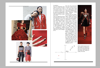
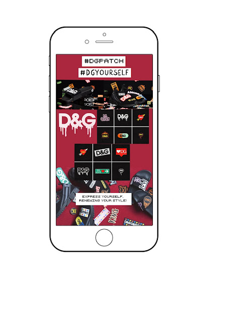
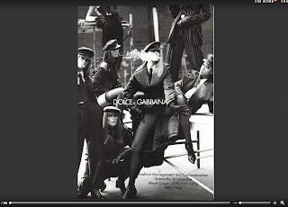
Here are some screen shots I took earlier on in my marketing report development. This useful to look back at and see the improvements I have made, I also think it is useful to keep them incase I didn't like how I had changed it and wanted to go back to how it was. I definitely think in the first spread threre it too much going on and it needs to be made much more simple, I also think that the text needs to be positioned into the middle of the page in the last one. I am happy with the changes I Made to these spreads and it definitely took a long time to figure out how I wanted my report to finally look.


